You’re designing tracy, a one-stop shop mobile app for all things Tracy Chapman. You want a discography page that displays all of her album covers organized into rows. You want to be able to select an album to view its track listing directly below the album, driving the rest of the page content down. Then you want to select the album a second time to re-hide the track listing, driving the rest of the content back up. Pretty standard expand/collapse functionality. So, how do you model this out in Justinmind?
As with most interactions, there are multiple ways to simulate expand/collapse in Justinmind. For example, you can create duplicate views of the same page; one for “collapsed” and another for “expanded”. However, you’d then be maintaining the same content in two places, doubling the amount of rework for any adjustments needed down the road. If your goal is to have the same content actually move up and down the screen to simulate a true expand/collapse interaction, your best practice is to utilize the Dynamic Panel Vertical Layout setting.
————————————————————
By choosing a Vertical Layout for a Dynamic Panel (as opposed to the default Free Layout), Justinmind automatically aligns panel content to be stacked directly on top of each other, as shown below:

Free Layout

Vertical Layout
As you show and/or hide page elements while using Vertical Layout, Justinmind automatically realigns the vertical stacking, allowing you to simulate a true expand/collapse interaction. The tutorial below outlines the steps you can take in order to create a Dynamic Panel with a Vertical Layout, along with the events you’ll need to set up in order to simulate a simple expand/collapse. You’ll then see how to take the simple example and apply it to the more complex tracy scenario mentioned above.
————————————————————
Step 1) Create three rectangles and label them as Top, Middle, and Bottom:

Step 2) Select all three rectangles, right-click, and select “Group in dynamic panels”:

Step 3) In the properties tab of the newly created dynamic panel, select Vertical Layout:

Step 4) In the properties tab of the middle rectangle, select the eye icon to set the rectangle as hidden by default:

Step 5) Create a label named “Expand/Collapse”, then attach an event to the newly created label that toggles the show/hide option for the middle rectangle:

Your prototype is now set up to hide the middle rectangle by default, then toggle between showing and re-hiding it as you click the Expand/Collapse label.
Step 6) Simulate the prototype to bring up the default view, displaying only the top and bottom rectangles:

Step 7) Select the Expand/Collapse label to show the middle rectangle:

You’ll see that Justinmind automatically realigns the stacked content and drives the bottom rectangle down to make room for the middle one. Also note that because we created the show/hide event in Step 5 using the “on Toggle” option, you can continue to select the “Expand/Collapse” label, and Justinmind will continue to toggle between showing/hiding the middle rectangle, simulating that expand/collapse interaction we were looking for. Huzzah!
————————————————————
Alright, so how is this relevant to our tracy example? As with most things in life, this too can be easily be applied to Tracy Chapman’s discography.
We took a simple approach in our tutorial above and used three rectangles in our dynamic panel. However, you can replace those rectangles with just about any other element in Justinmind, including another layer of dynamic panels. By taking a page out of the Inception playbook and creating dynamic panels within a dynamic panel, we have the ability to create some complex interactions, including the discography/track listing scenario mentioned above.
————————————————————
Instead of a top, middle, and bottom rectangle, let’s create a dynamic panel for the top row of albums, another dynamic panel for the bottom row of albums, and a third dynamic panel for the track listing in the middle. Then, let’s group these three dynamic panels into a master dynamic panel as we did in our tutorial, and select Vertical Layout for that exterior master panel (we can keep the Free Layout for the interior panels):
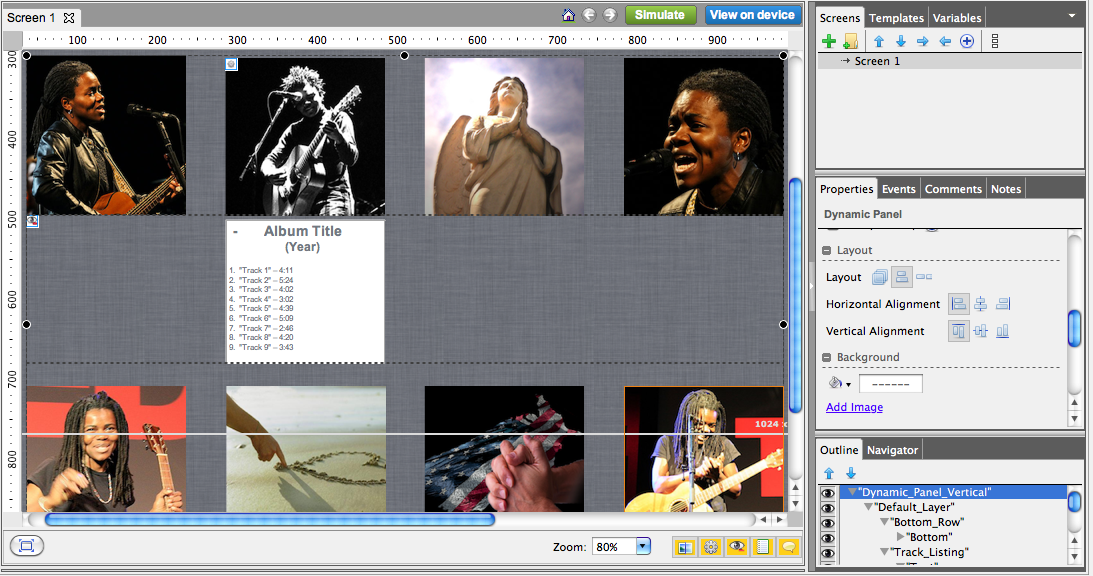
We can then follow the same steps from our tutorial and set the track listing middle panel to hidden by default, as well as create an event that toggles the show/hide action for this middle panel. Instead of creating a new label called “Expand/Collapse”, we can simply attach the show/hide event to an album image – in this example, the 2nd image from the left – in order to demonstrate how a user would select a specific album to view its track listing.
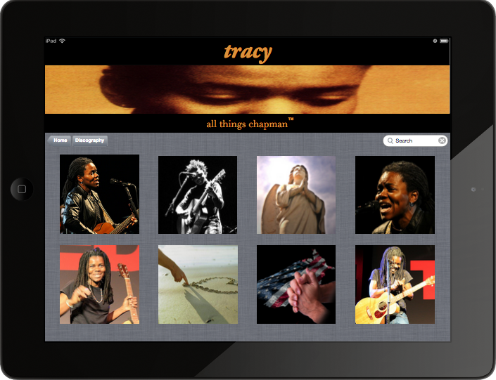
When we simulate our prototype, we see the default view of our discography page, displaying only the top and bottom panels:
And finally, when we select the album image, our middle panel is displayed, revealing the track listing for the selected album and driving the bottom panel down:

————————————————————
You can continue adding as much complexity as you’d like to the above scenario. For example, you can create multiple views of the middle track listing panel – one for each album – then create multiple events in order to display the corresponding track listing for whichever album is selected. Just remember to start small. Whether it’s a couple of rectangles or a Chapman discography, always make sure your foundation is solid.

